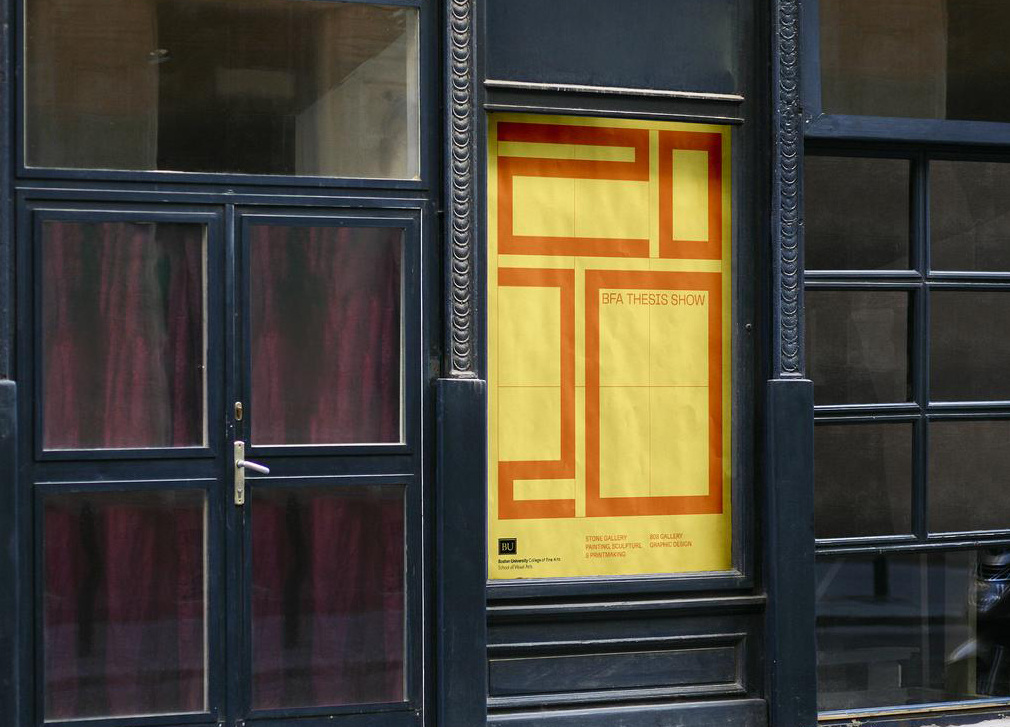
The branding concept draws inspiration from the Kunsthalle (an ever changing art gallery with no permanent collection) and the School of Visual Arts’ rich history, and is grounded in form through the Rule of Thirds and points of interest.
The use of the 3 x 3 grid system to create points of interest and allow for expansion and shifting within the space. The “✕” also emphasizes this concept, serving to highlight these points of interest and the space between them.
Although we weren’t able to have the thesis show we had imagined, we still decided to create print and web promotional materials that could help highlight the incredible work that the BU CFA Class of 2020 made.
Designed and coded website: 2020bfathesis.show
Brand Identity, Motion, Print, Web Design
Client: Boston University’s College of Fine Art
Collaborators: Angela Sun, Jiayi Ma
Client: Boston University’s College of Fine Art
Collaborators: Angela Sun, Jiayi Ma


